
This is the poster for the film '300' about the Spartans defending their land. The film features many battle scenes and blood and this is shown by the typography used for the title. The typography has been made to look like blood and with pointed edges so that it looks like it is a battle scar or blood that has been splattered on a wall in the shape of '300'. This is really effective as we know exactly what to expect from the film just by looking at the titles or poster. The red is effective as it symbolises passion and violence in the film and contrasts well against the silouetted cliff in behind.

This is the typography used on the film 'last house on the left' which is a horror film in which two girls are abducted. The typopgraphy is white with the main word in red to look like a wound or something similar and there is scratches across the word to show there will be a struggle involved in the film. This idea of using violent styles for the typography is interesting and could work well with our film as it shows violence and a struggle is going to happen.
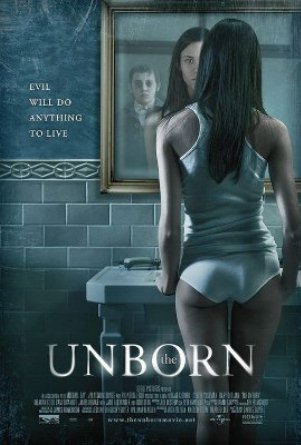
This poster is for the film 'The Unborn' about a child who dies and tries to come back. The typography used is quite simple but has been made to look ghostly by bluring the edges of the lettering. The title refers to the ghost which haunts the girl in the film and the refelction in the mirror in the image helps to show us that this film is going to be about the dead trying to come back. I really think that the typography we use needs to link obviously to the story so that the audience knows what to expect just from the opening.
No comments:
Post a Comment